Vanity-Men
For Vanity Men, our goal was to create a brand presence that doesn’t sound but leaves a lasting impression. We leaned into a sophisticated black and white palette, not just as aesthetic choice but as a statement of sophistication, strength, and timeless style. Every element, from typography to layout, was carefully curated to reflect modern masculinity, minimalism, and elegance.
Sector
Men’s Grooming
Services
Logo Design
Brand Identity
Brand implementation
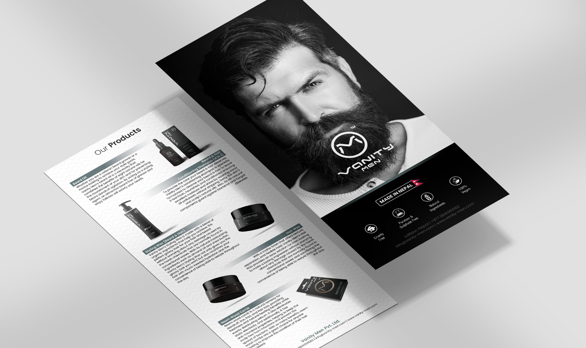
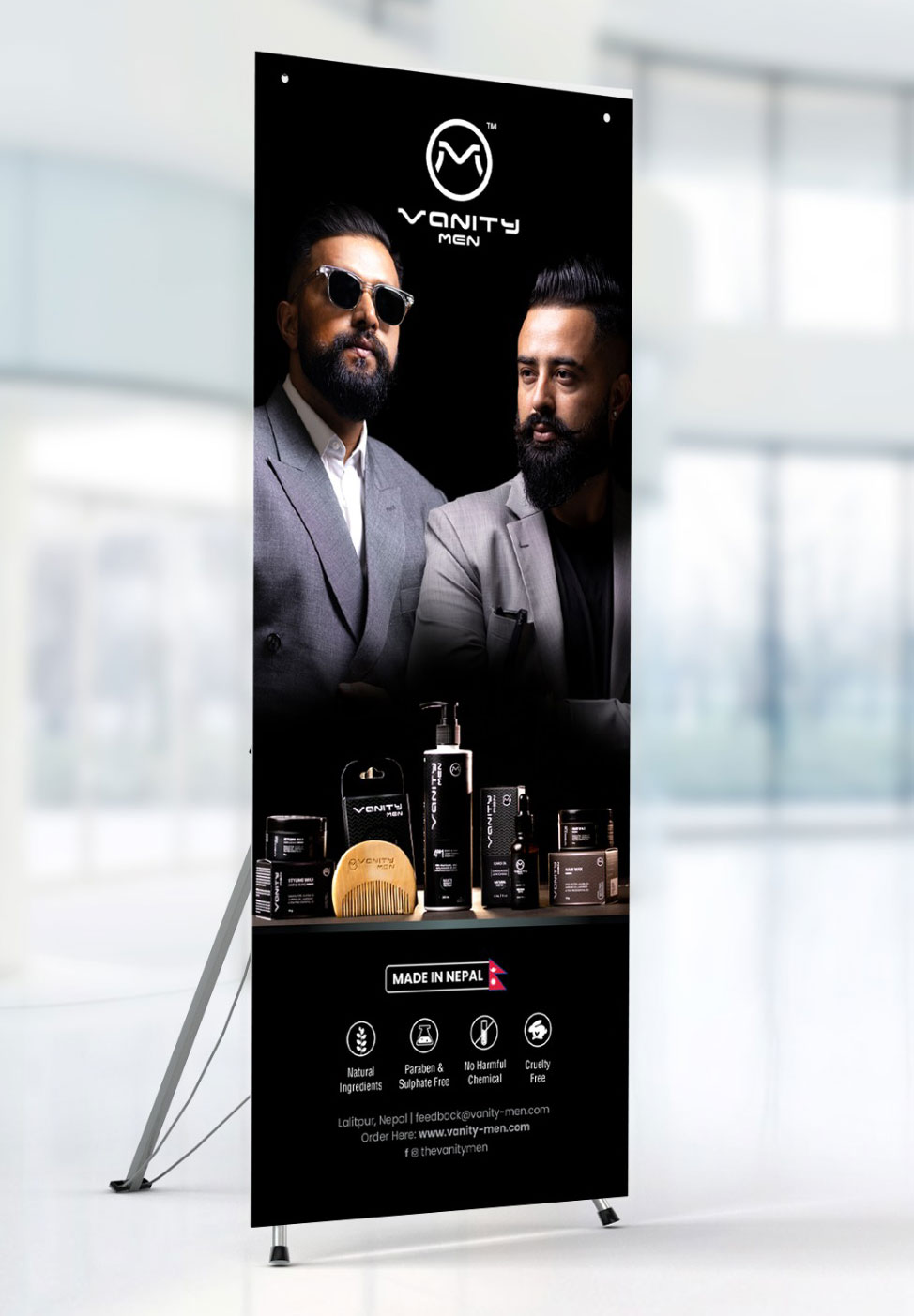
Packaging, Outdoor Branding
Brand Assets Delivered
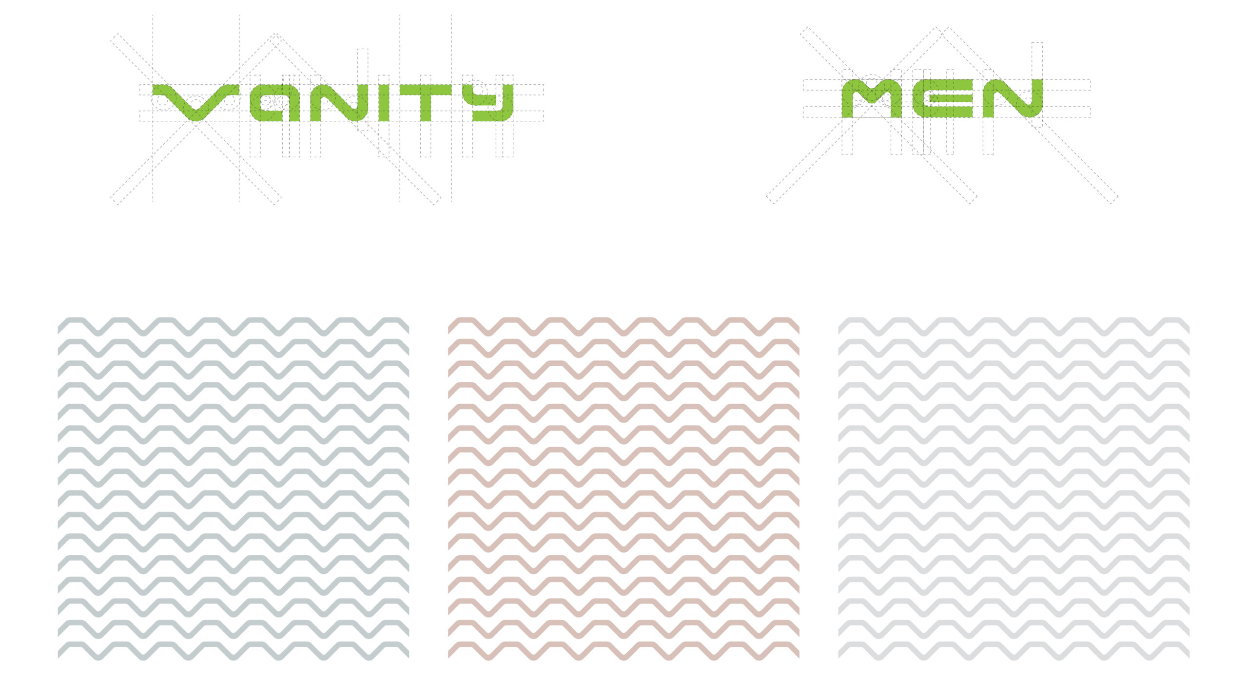
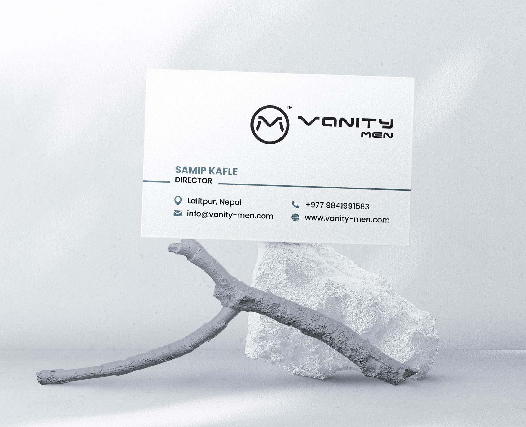
50+The Vanity Men logo features a bold monogram, merging the letters “V” and “M” within a sleek circular frame to create a sophisticated look. This signature mark is also woven across brand materials to strengthen recognition and reflect a commitment to cohesive, high-end design.

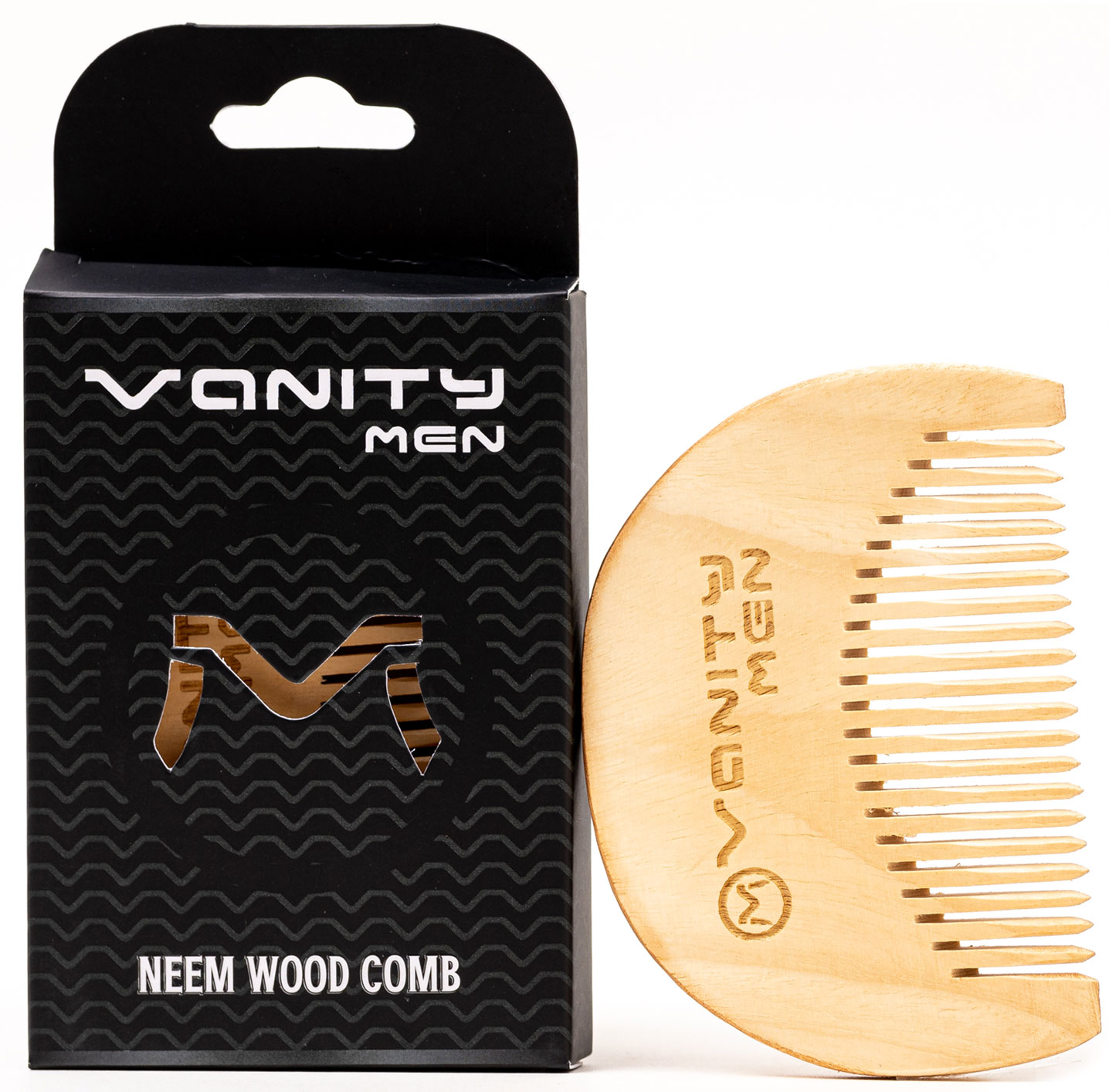
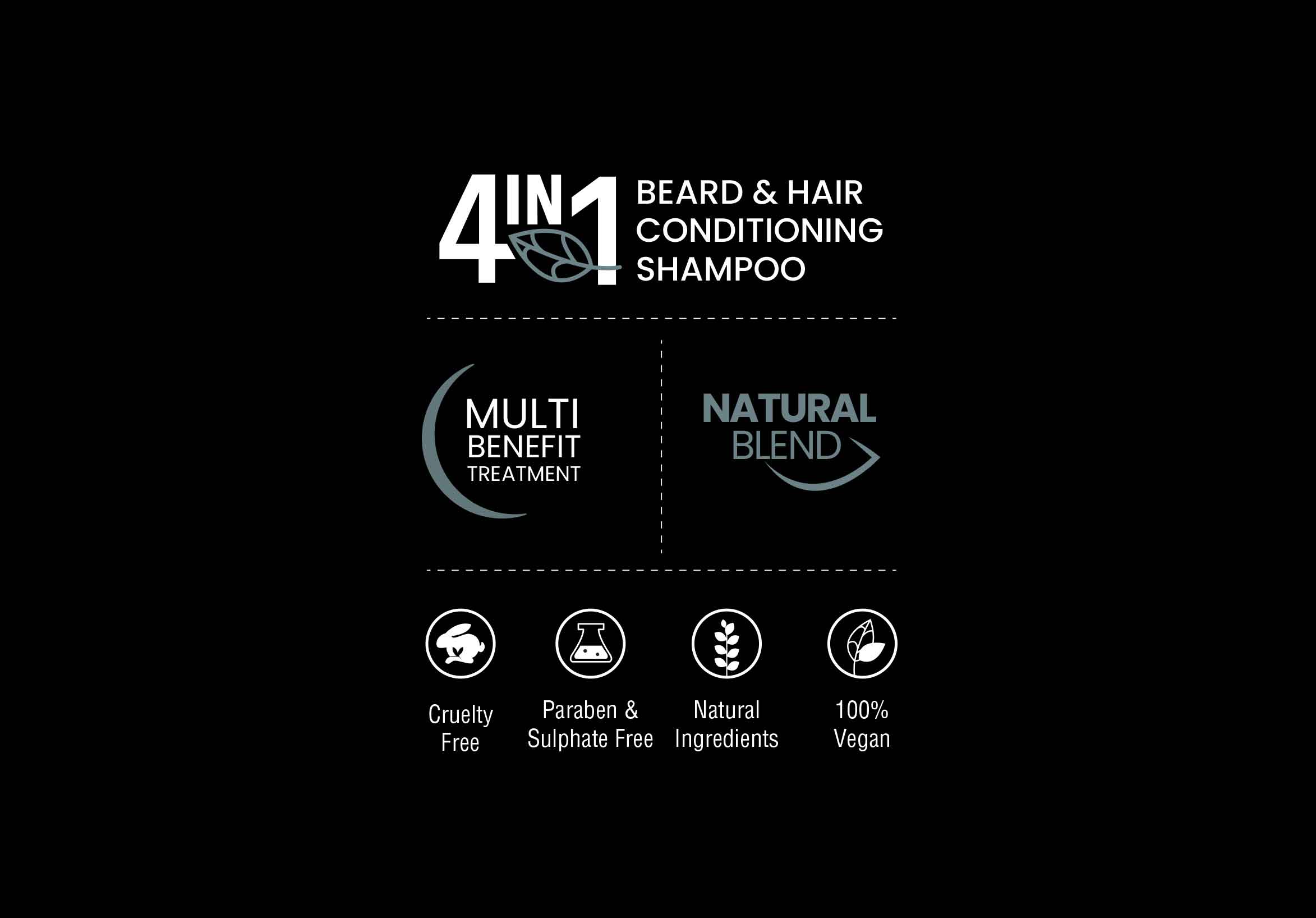
The packaging for Vanity Men embodies a minimalistic design. A stark black-and-white palette paired with clean, uncluttered layouts delivers a modern, sophisticated look reflecting the brand's aesthetic value.
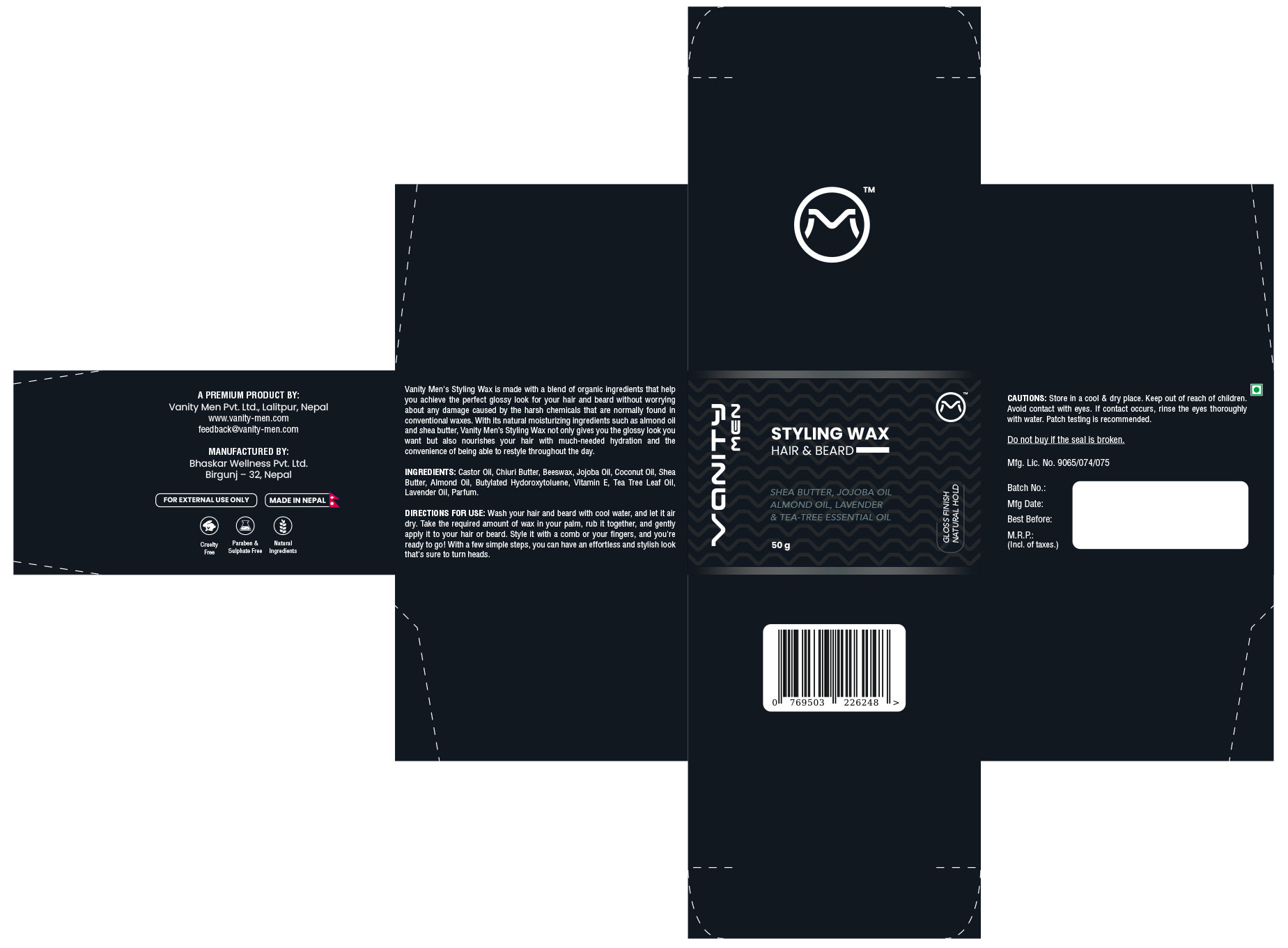
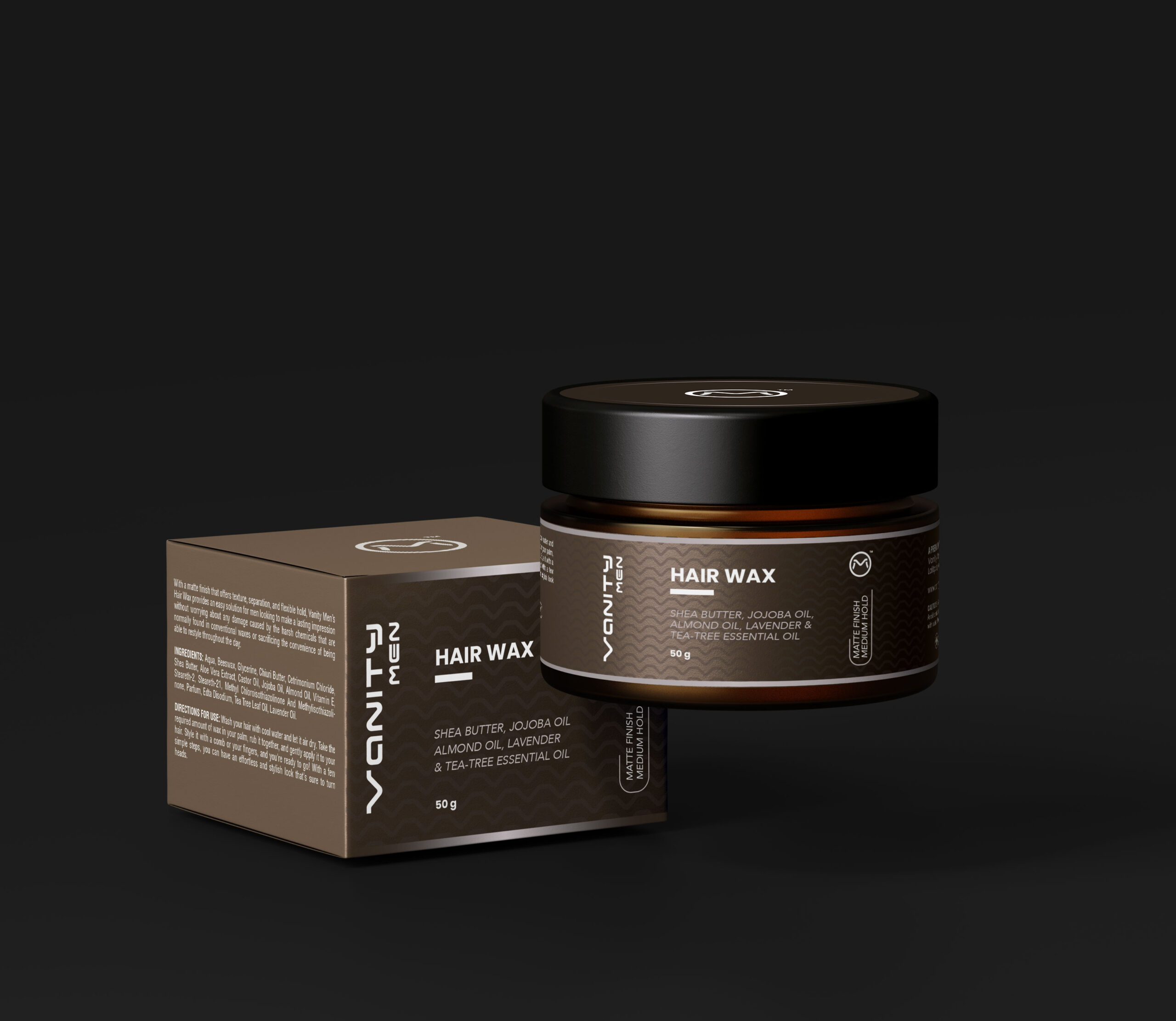
We ensured visual consistency across the jar and box by maintaining a unified design language. The monogram reinforces the brand’s simplicity, while subtle, minimalist icons clearly communicate key product details without disrupting the sleek visual tone.
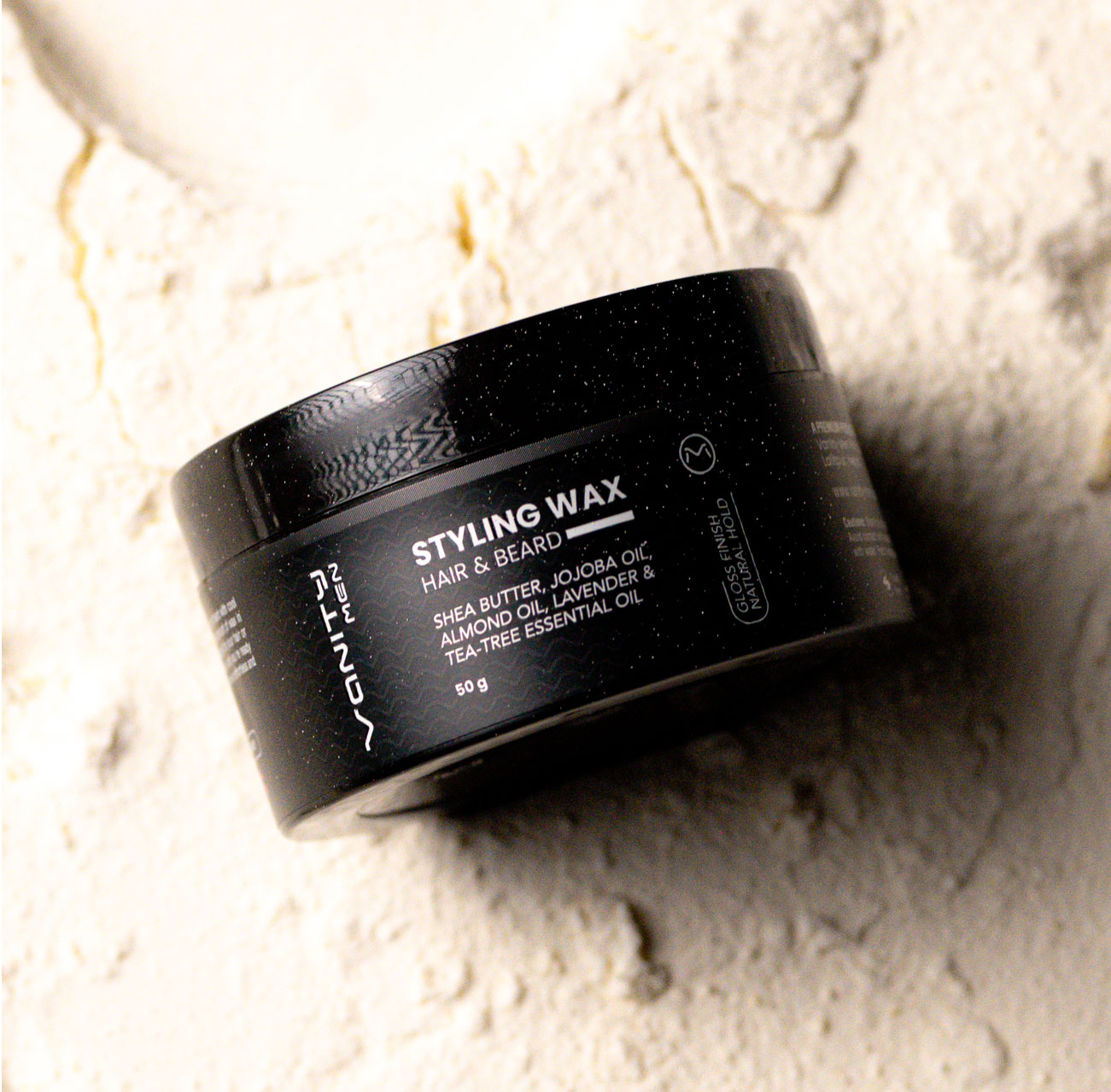


Overall, the design choices for both the packaging and the product effectively communicate a sense of quality, natural materials, and understated sophistication, aligning with the established Vanity Men brand identity.