Attic Inn
For Attic Inn, our designs focused on capturing the nostalgic charm and cozy simplicity of the hospitality sector. The logo showcases a stylized attic roofline with a delicate window detail, beautifully complemented by the elegant Yukita typeface. To enhance the welcoming ambiance, we carefully selected warm color palette of terracotta, cream, and slate gray.
Sector
Hotel Franchise
Services
Brand Identity
Production
Promotional Materials
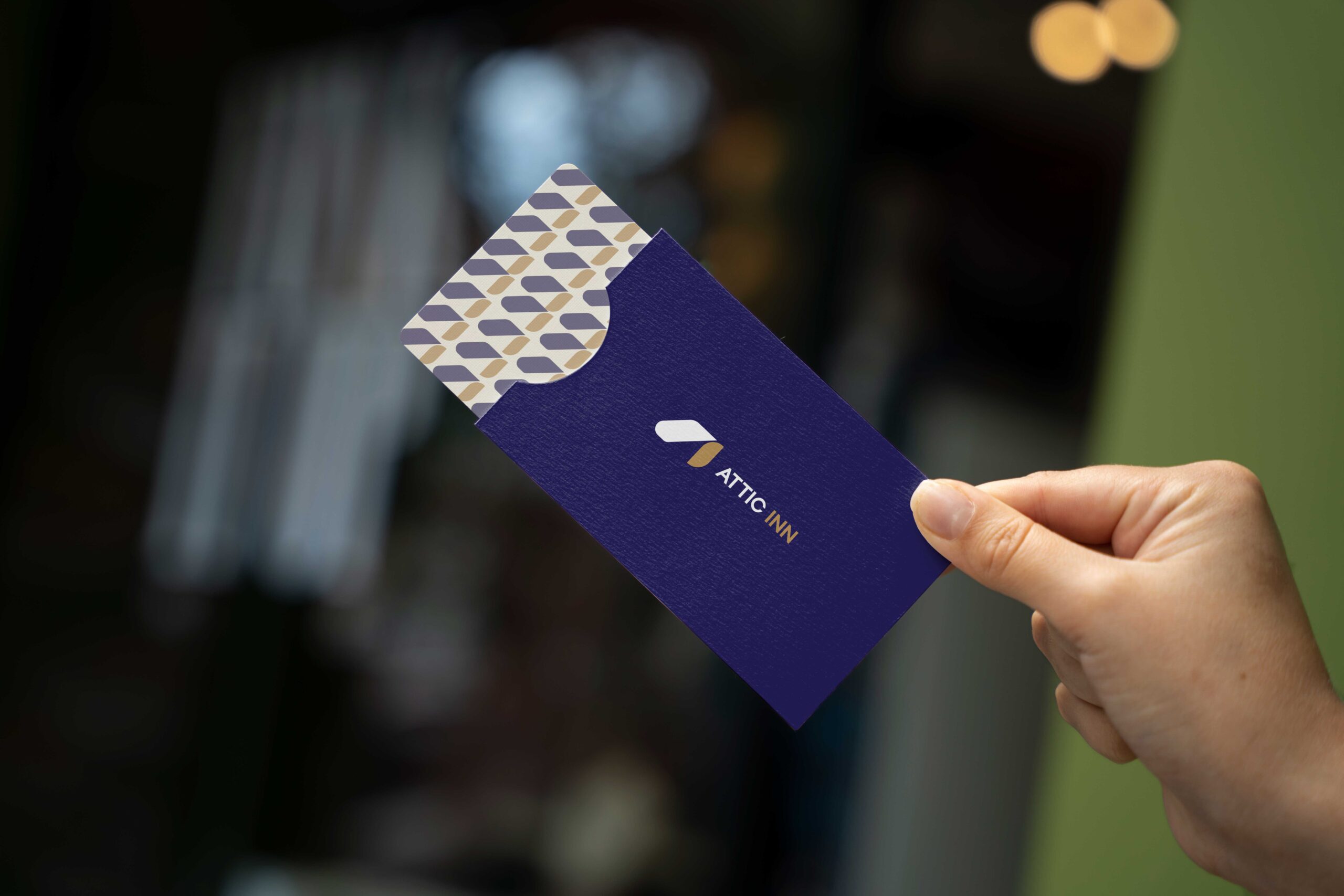
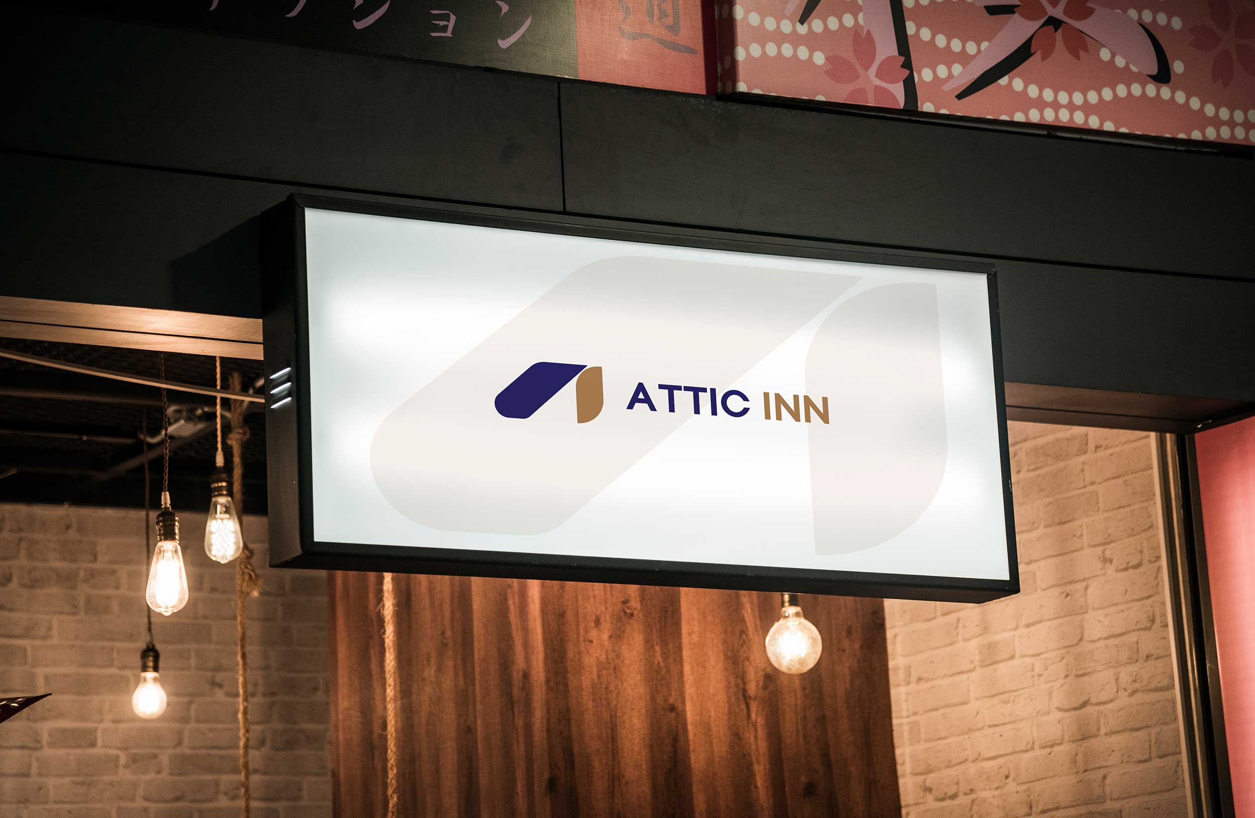
We carefully blended a stylized roofline with the letters “A” and “I” for the logo of the Attic Inn to symbolize home and comfort. Our designs went through several iterations to create a mark that’s both distinctive and timeless.
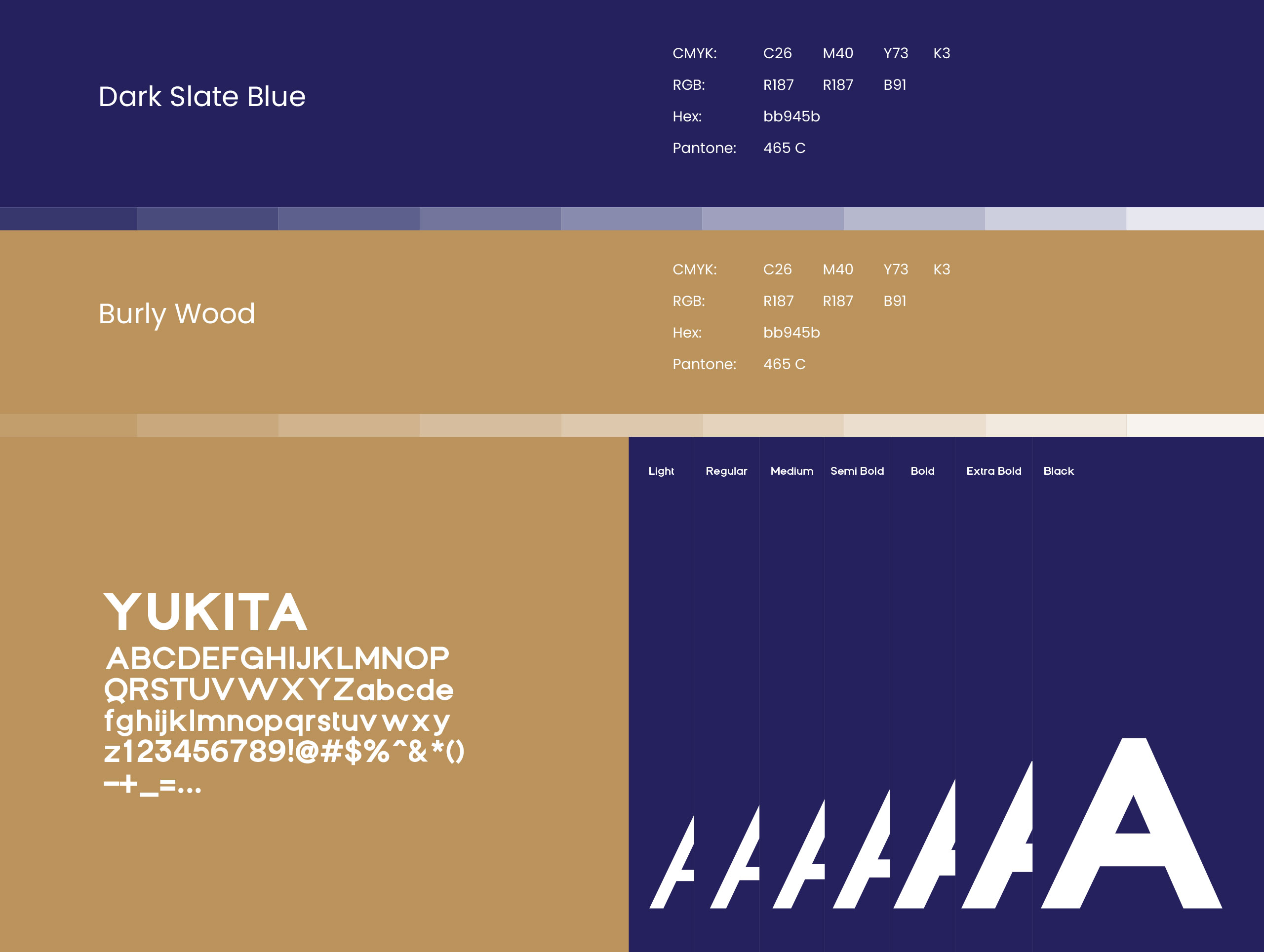
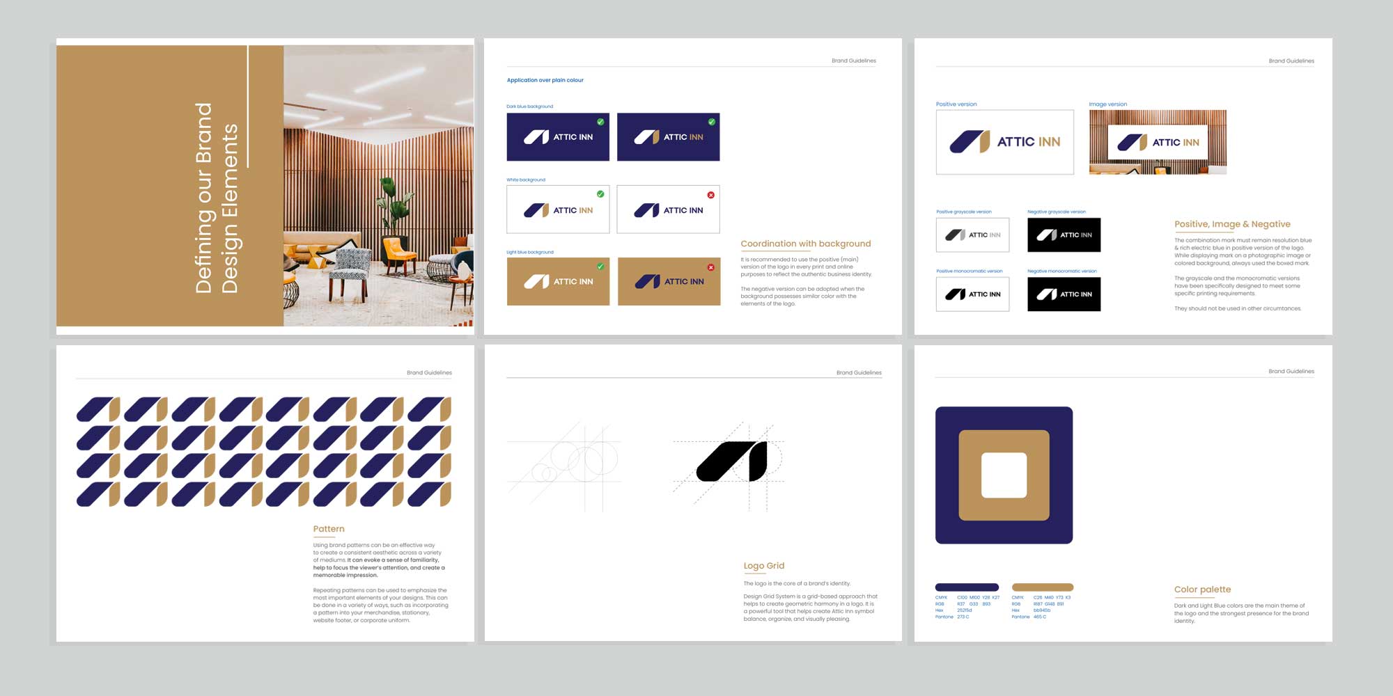
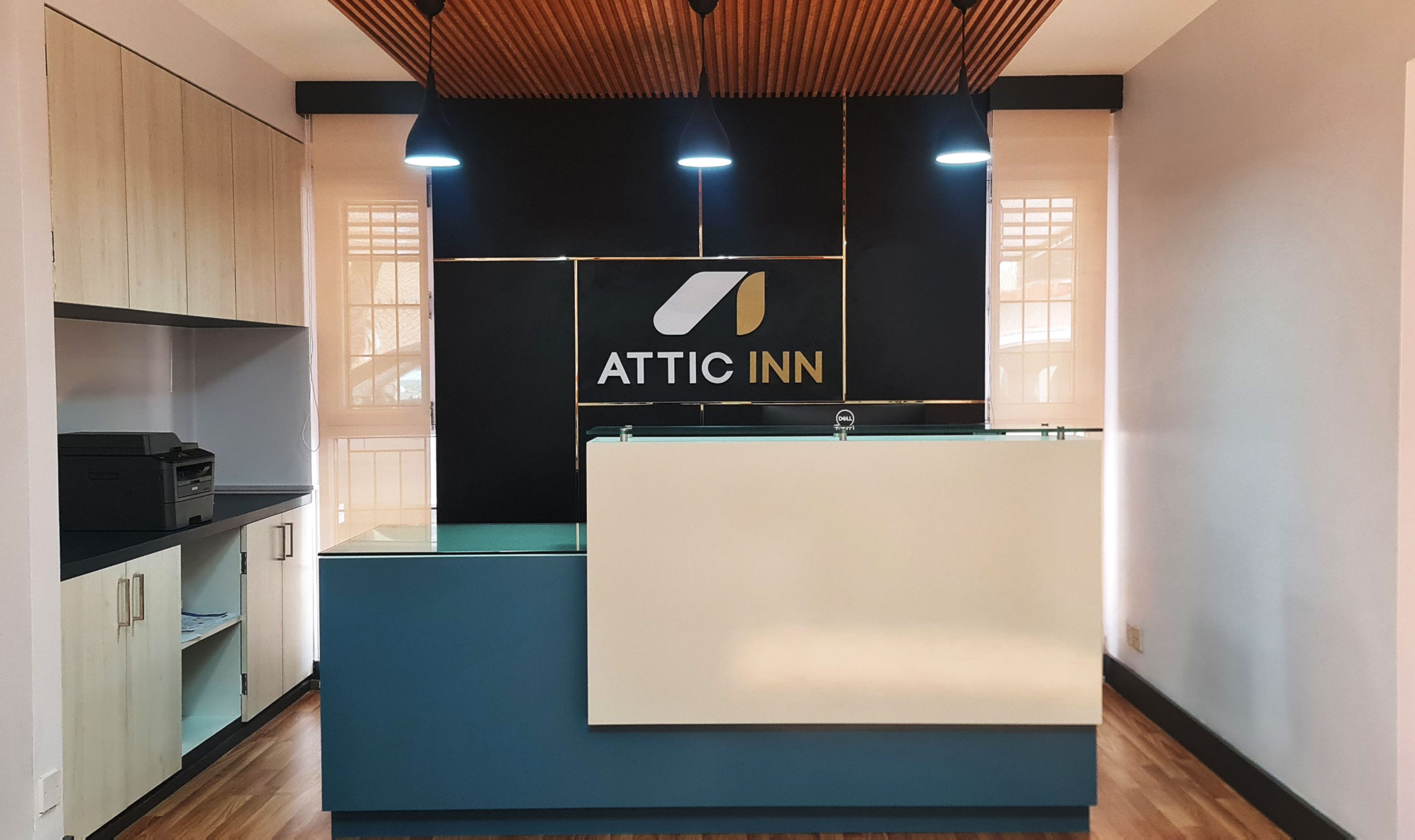
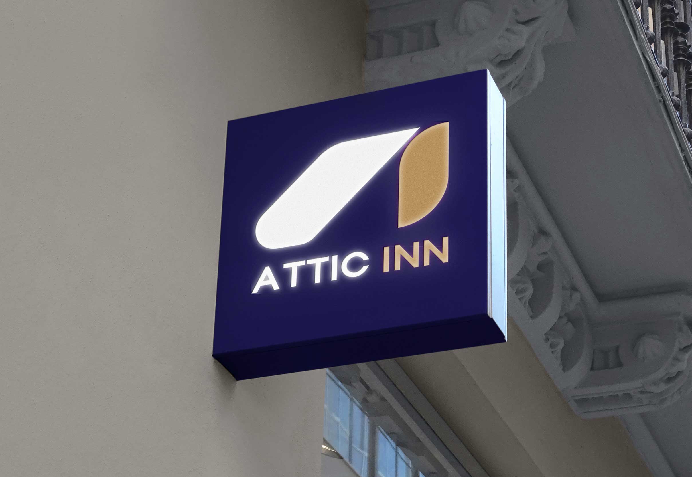
The designs included classic serif for headings, paired with clean sans-serif for body text to a balance of style and readability. To evoke trust, warmth, and sophistication of hospitality, we used calming deep blue and warm gold color palette.

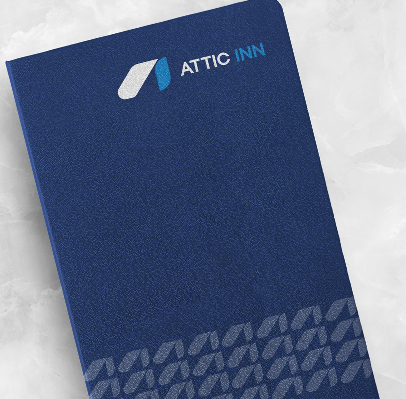
We carried Attic Inn’s brand across business cards, stationery, signage, and brochures. Our consistent design helped them strengthen their identity and ensured a smooth, cohesive experience for guests.