Euro School Chaunni
We are the design, print, and web partner for Euro School Chhauni, supporting them with everything from small design elements to large-scale projects, including complete website development. We also help maintain a consistent brand image across every event, ensuring it reflects the school’s identity and values.
Sector
School Education
Services
Brand Identity
Print Production
Website Design and Development
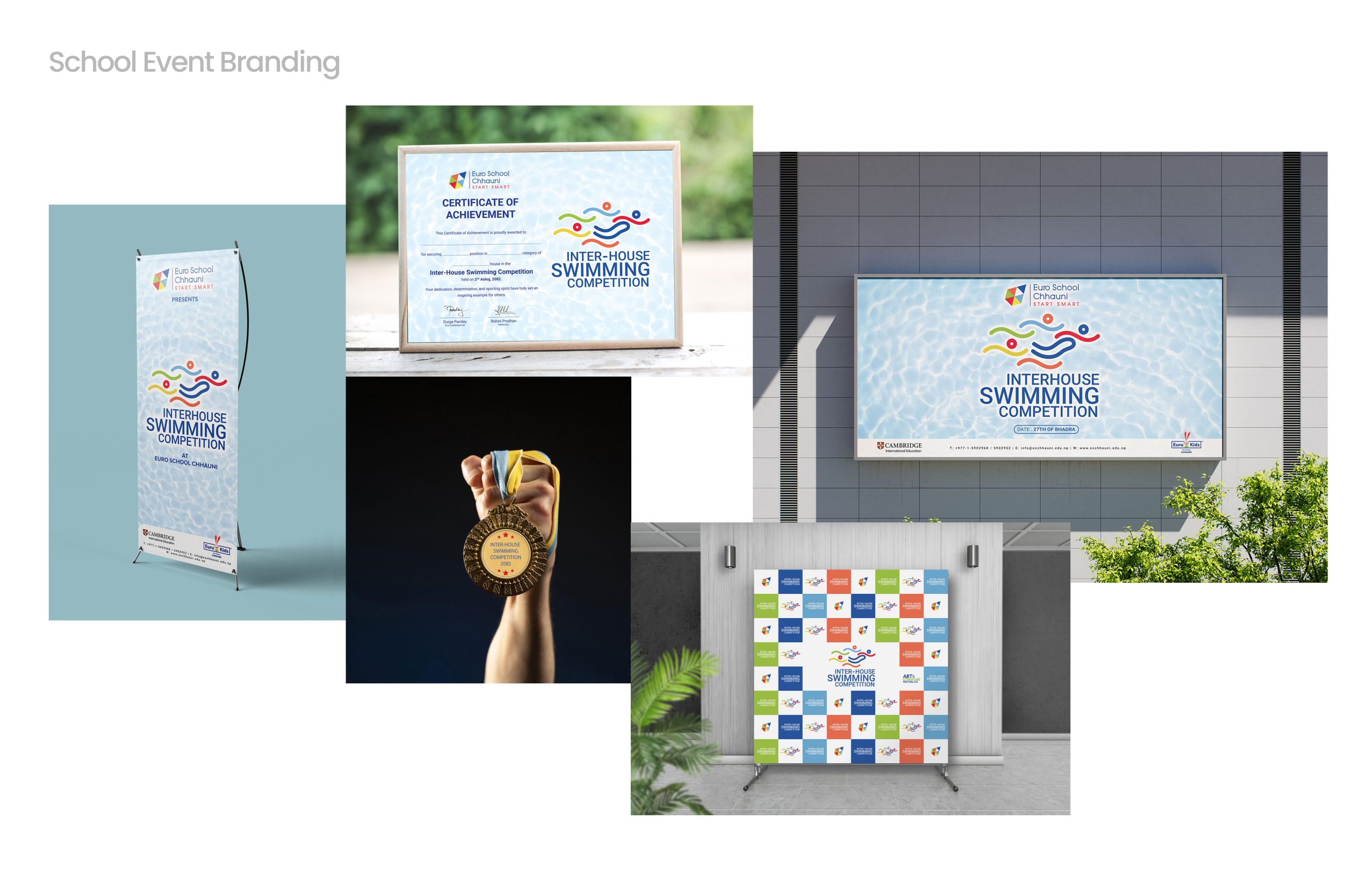
Event Branding
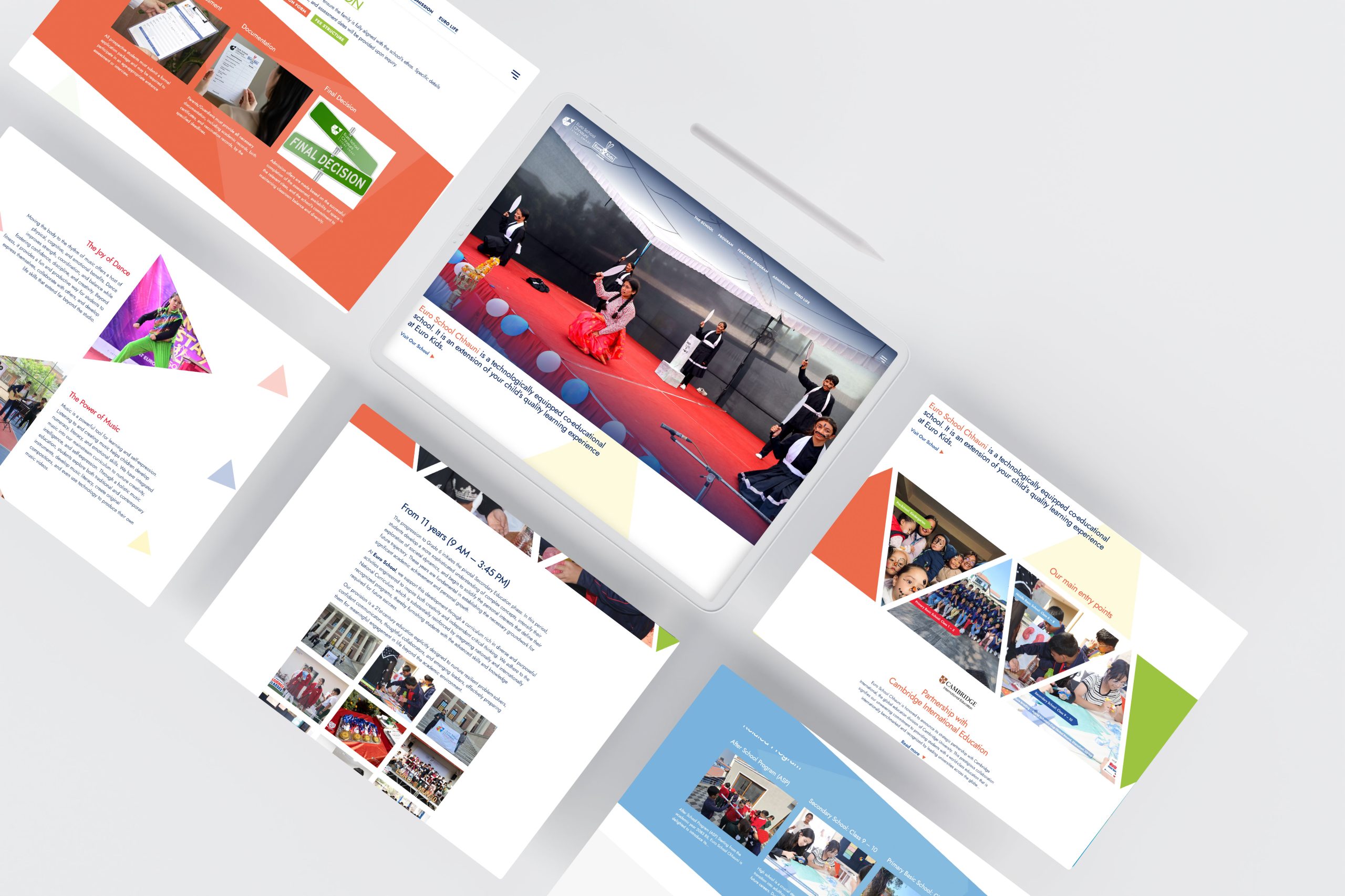
The website should reflect the school’s overall online presence. We incorporate brand elements throughout to maintain consistency, while creating a user-friendly platform that effectively connects students, teachers, and parents.
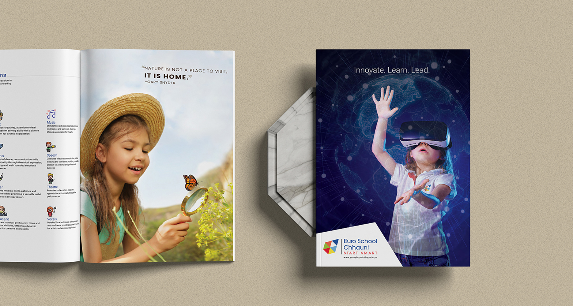
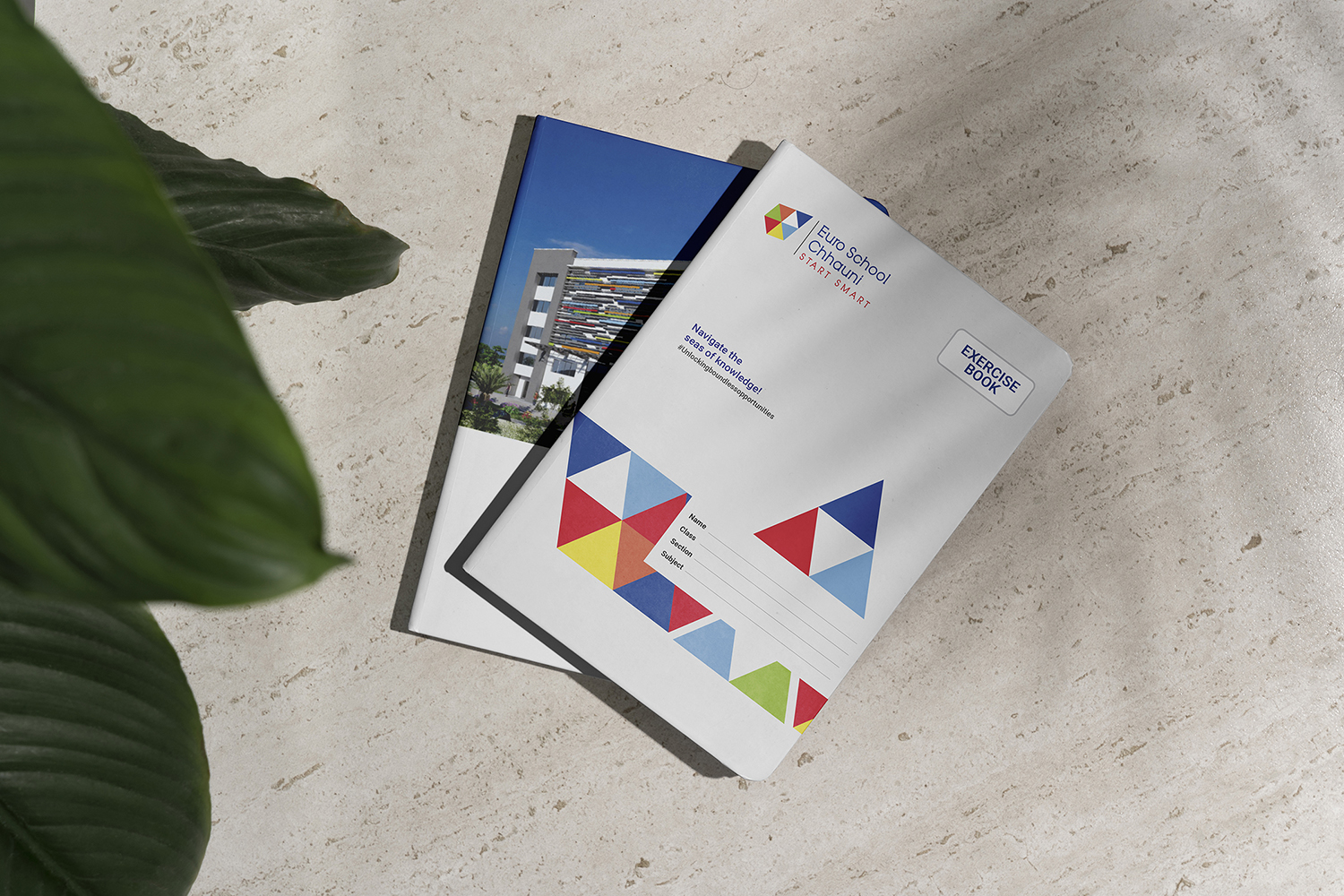
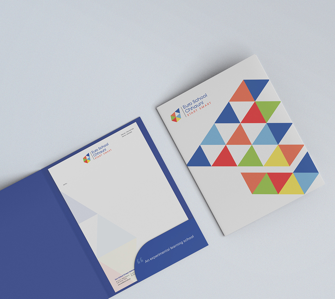
We support the school with high-quality collateral design and printing, ensuring students experience a premium feel that adds value and fosters a culture of quality and excellence.
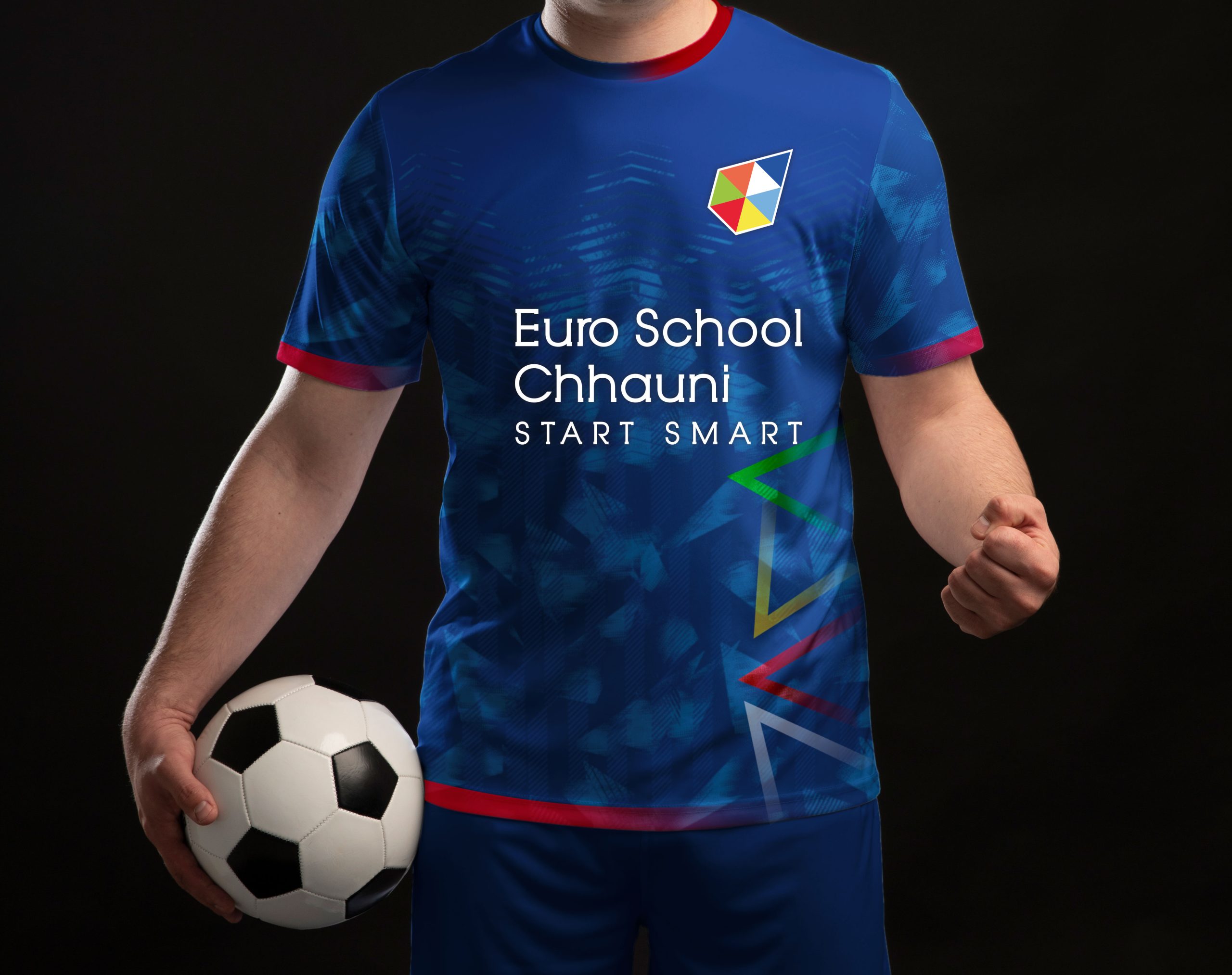
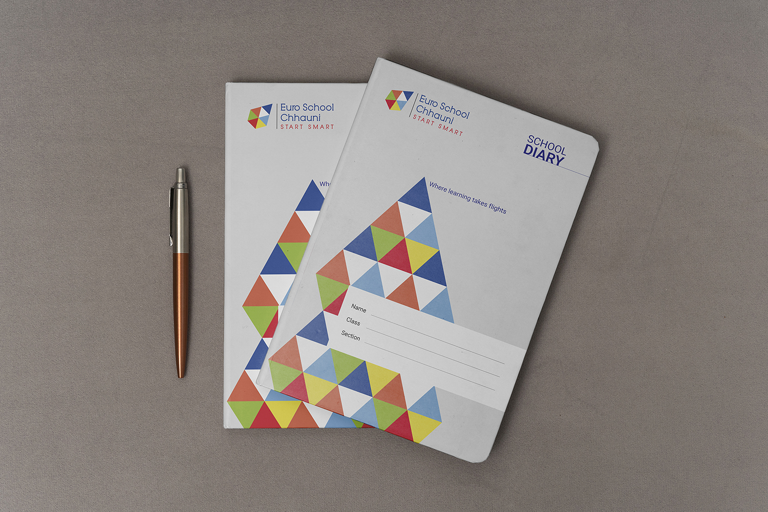
Genius design elevates a school’s identity—creating a consistent, premium, and professional image. It enhances communication, builds trust, and shapes a culture of quality, discipline, and excellence across every student and interaction.