Himalayan Everest Insurance
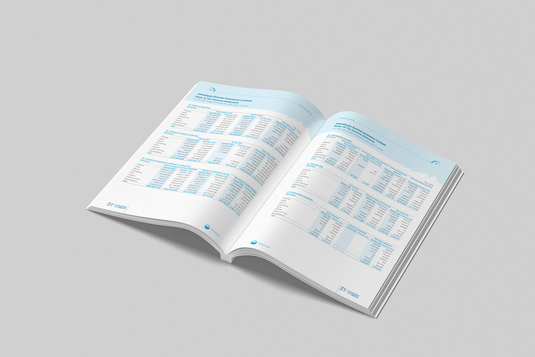
For Himalayan Everest Insurance, we built a visual identity around blue and white to reflect what it stands for: trust. Our design approach was all about structure and precision. To truly capture the disciplined and informative spirit of the company, we used custom patterns, insightful graphs, and clear, well-organized tables. These tools made information easy to understand and data-driven communication shine.
Sector
Insurance Company
Services
Layout Design
Printing
Cover Design
Icon Design
Brand Assets Delivered
50+To make the headings pop, we used a bolder weight or a contrasting yet clean sans-serif typeface. The limited color palette contributes to a trustworthy feel and ensures that information is presented without any distracting elements.
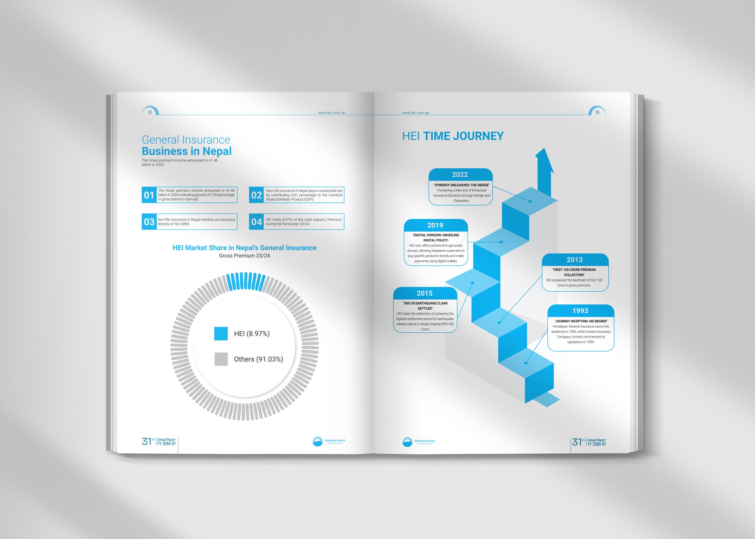
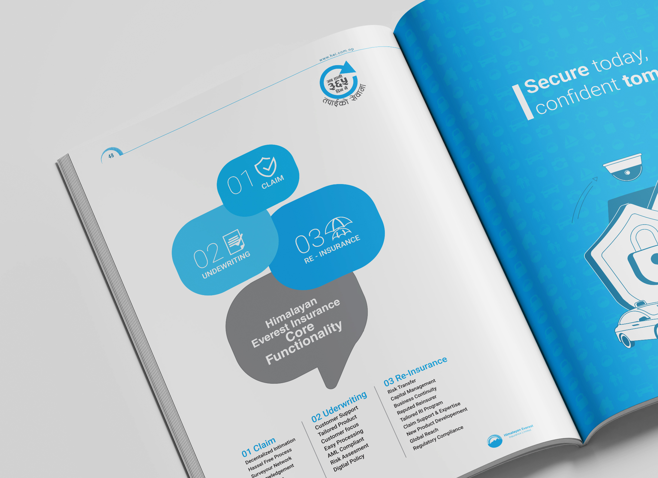
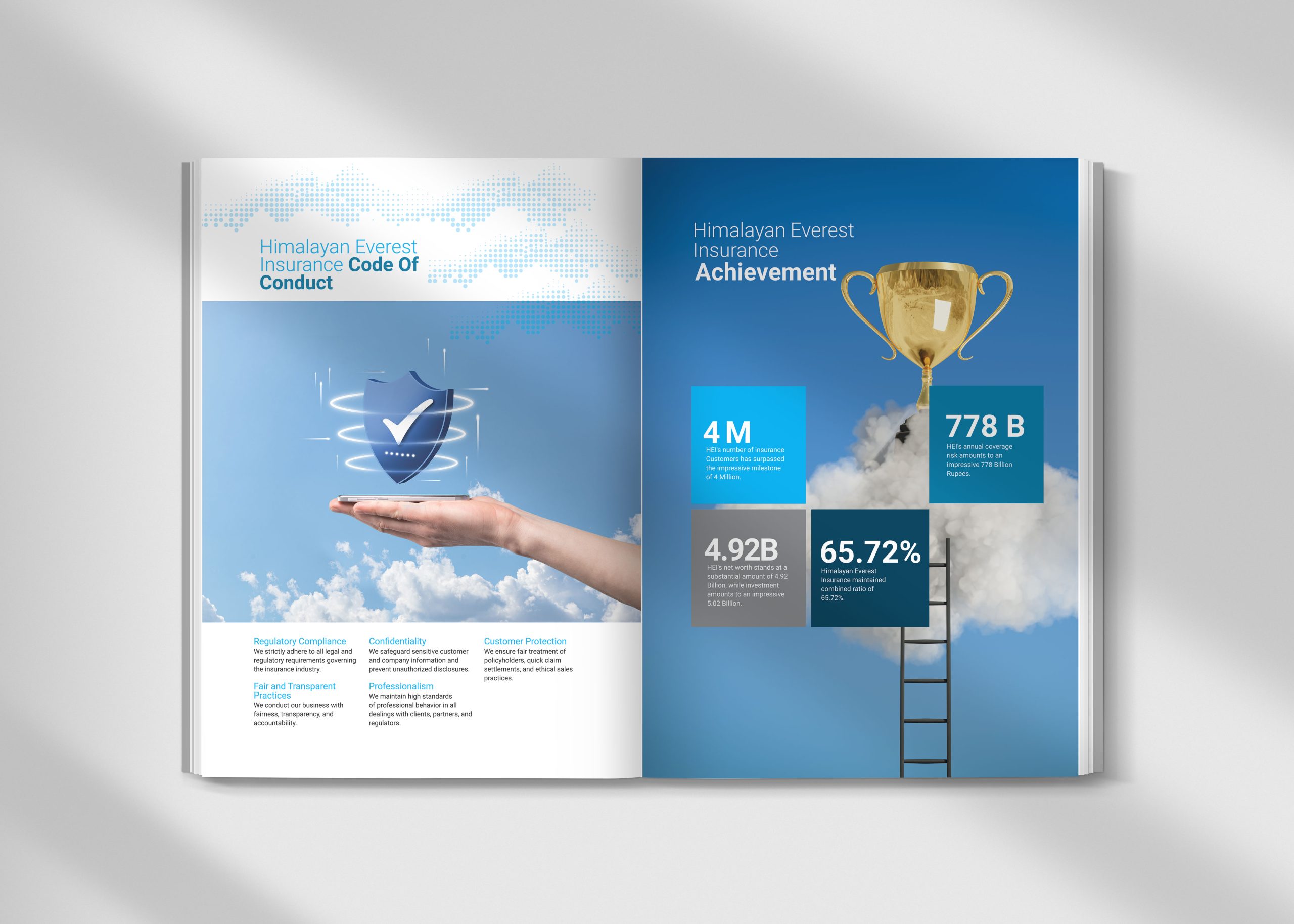
For the annual report, we designed clean, symbolic icons that efficiently represented complex data. These icons, when paired with our visually hierarchical infographics, created an instantly digestible snapshot of key financial highlights.
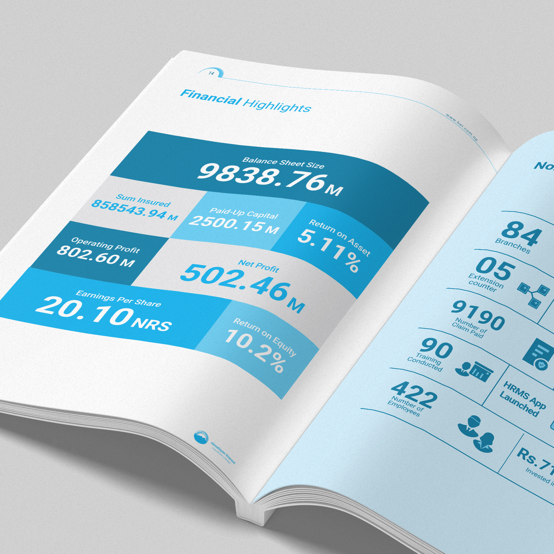
This thoughtful combination ensured clarity and impactful communication of critical information, helping readers grasp essential insights at a glance.