The logo highlights “GOOD” with its two “O”s depicted as semi-circles, creating a truly unique visual. This design is paired with the “Food Nepal” to balance creativity and clarity. Throughout the process, the focus was on refining the balance and legibility of this “cut O” concept, ensuring a memorable and versatile brand mark.
Month: May 2025
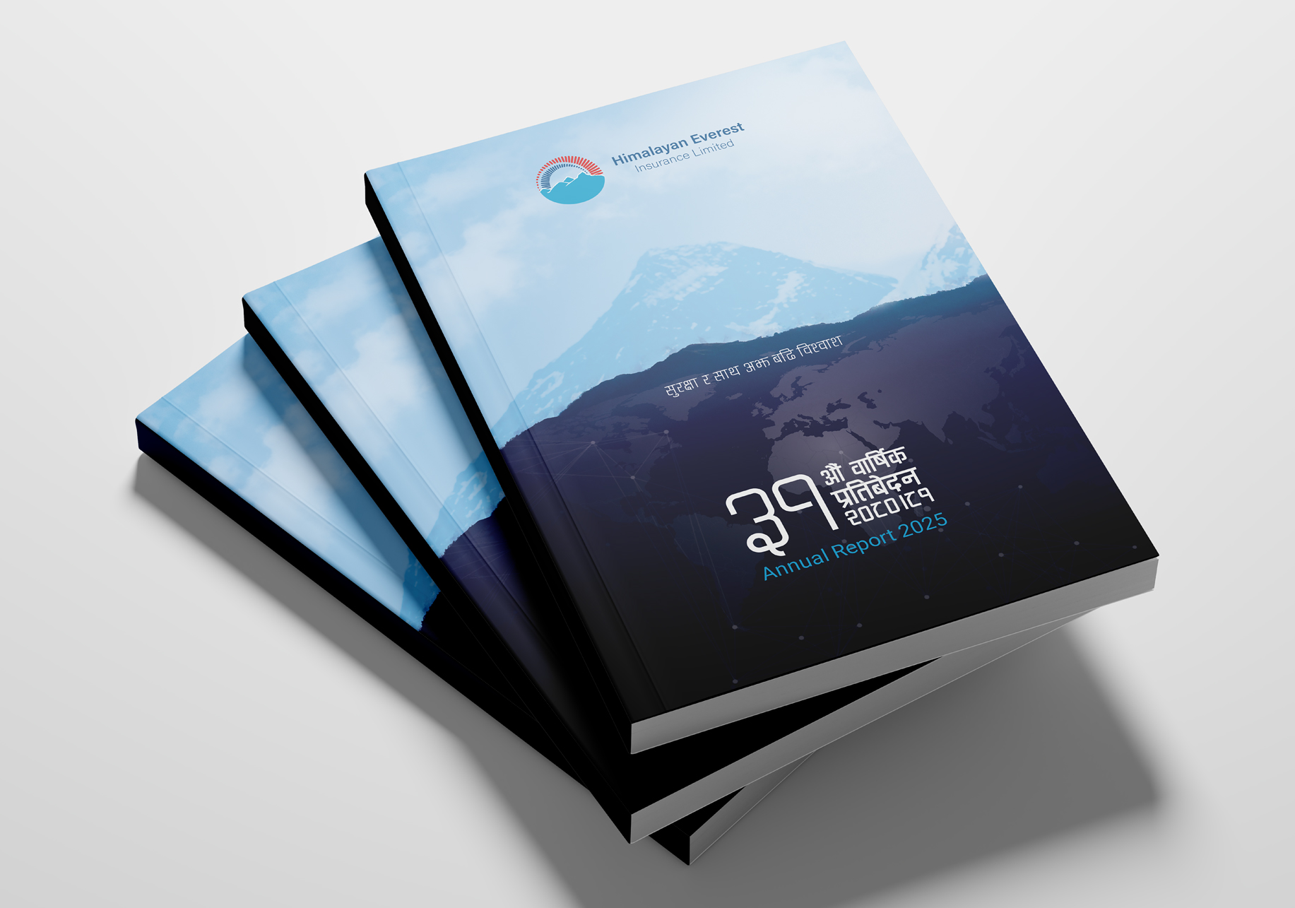
Himalayan Everest Insurance
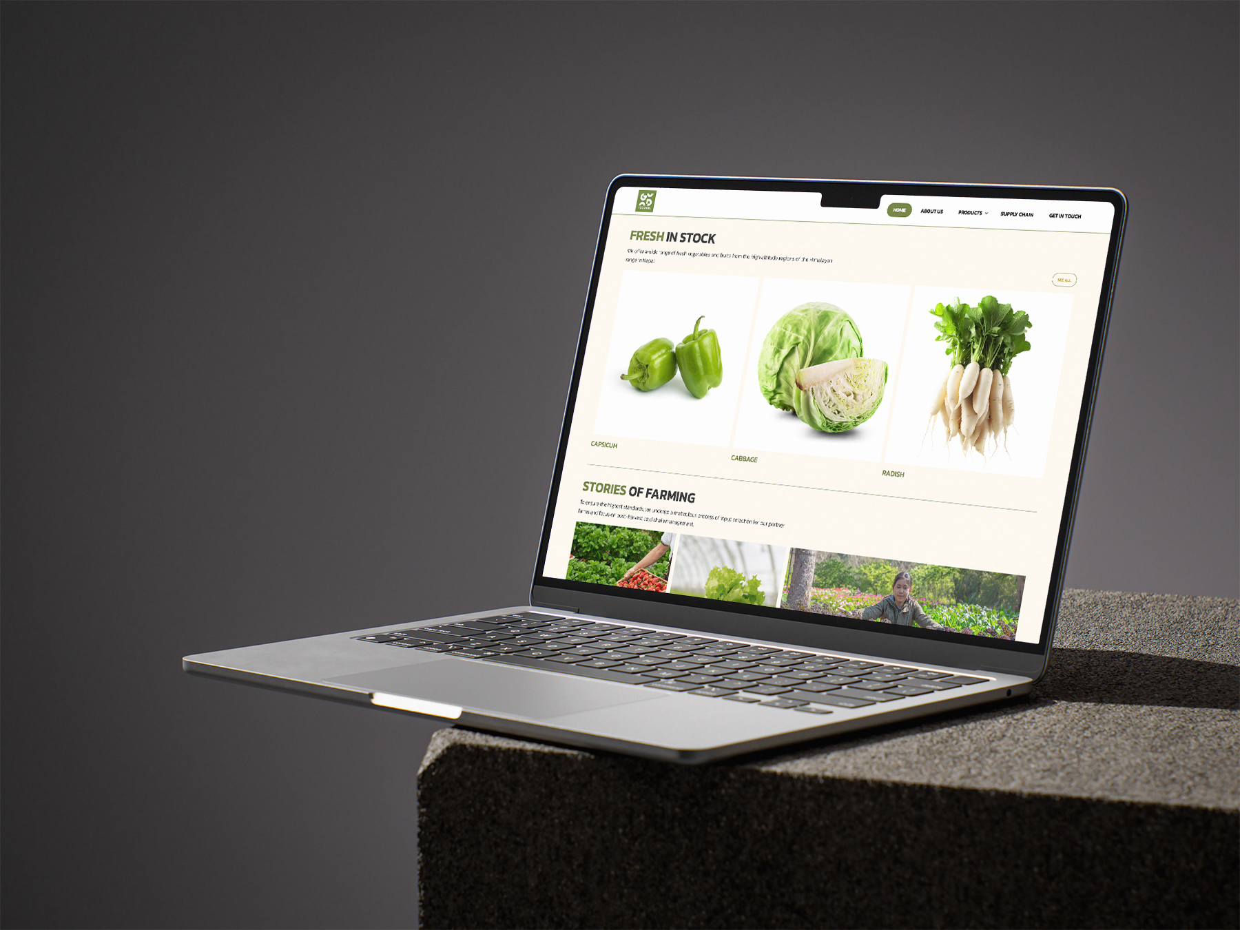
To make the headings pop, we used a bolder weight or a contrasting yet clean sans-serif typeface. The limited color palette contributes to a trustworthy feel and ensures that information is presented without any distracting elements.
