The Epic logo symbolizes progress, strength, and durability. Inspired by the geometric form of the vajra, it reflects precision, resilience, and timeless quality while honoring Nepal’s craftsmanship through a modern, versatile design.
Category: Uncategorized
Gyanshree School Baneshwor
We designed the logo to reflect Gyanshree School identity and core values. Each symbol represents Excellence, Knowledge, Learning, and Vision, creating a meaningful and recognizable visual identity.
Euro School Chhauni
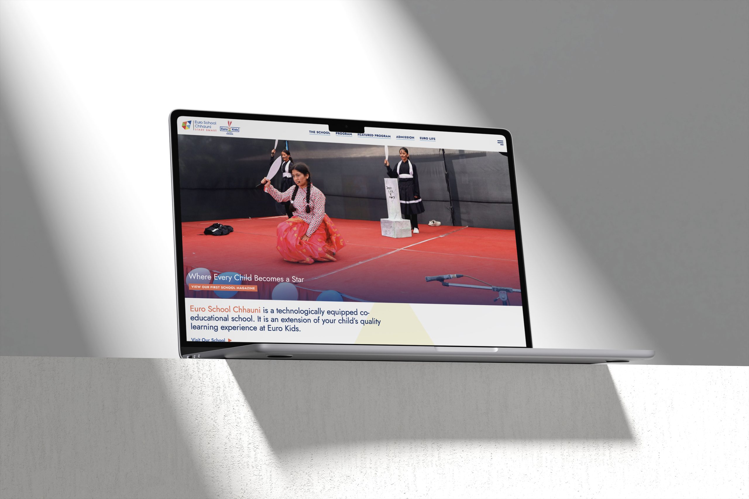
The website should reflect the school’s overall online presence. We incorporate brand elements throughout to maintain consistency, while creating a user-friendly platform that effectively connects students, teachers, and parents.
Nepal Olympic Committee
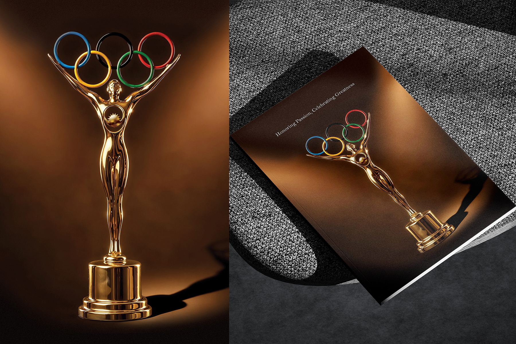
We had the opportunity to craft two magazines — the Award and Review editions. Both designs captured the true spirit of sports, and in the end, the outstanding printing quality impressed everyone.
Best Western Plus

Exterior hotel property photography during both daytime and nighttime is a highly challenging process that demands careful planning, technical expertise, and creative precision.
Good Food Nepal

The logo highlights “GOOD” with its two “O”s depicted as semi-circles, creating a truly unique visual. This design is paired with the “Food Nepal” to balance creativity and clarity. Throughout the process, the focus was on refining the balance and legibility of this “cut O” concept, ensuring a memorable and versatile brand mark.
Himalayan Everest Insurance
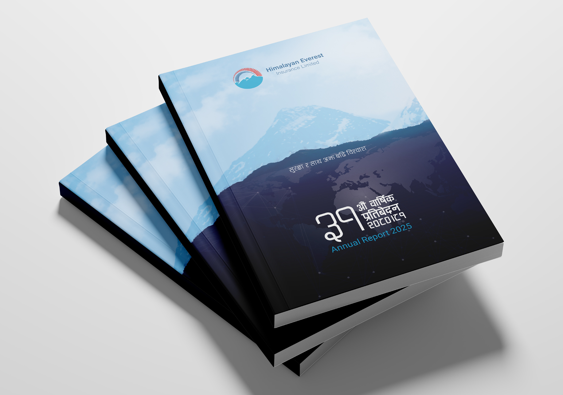
To make the headings pop, we used a bolder weight or a contrasting yet clean sans-serif typeface. The limited color palette contributes to a trustworthy feel and ensures that information is presented without any distracting elements.
Shilapatra
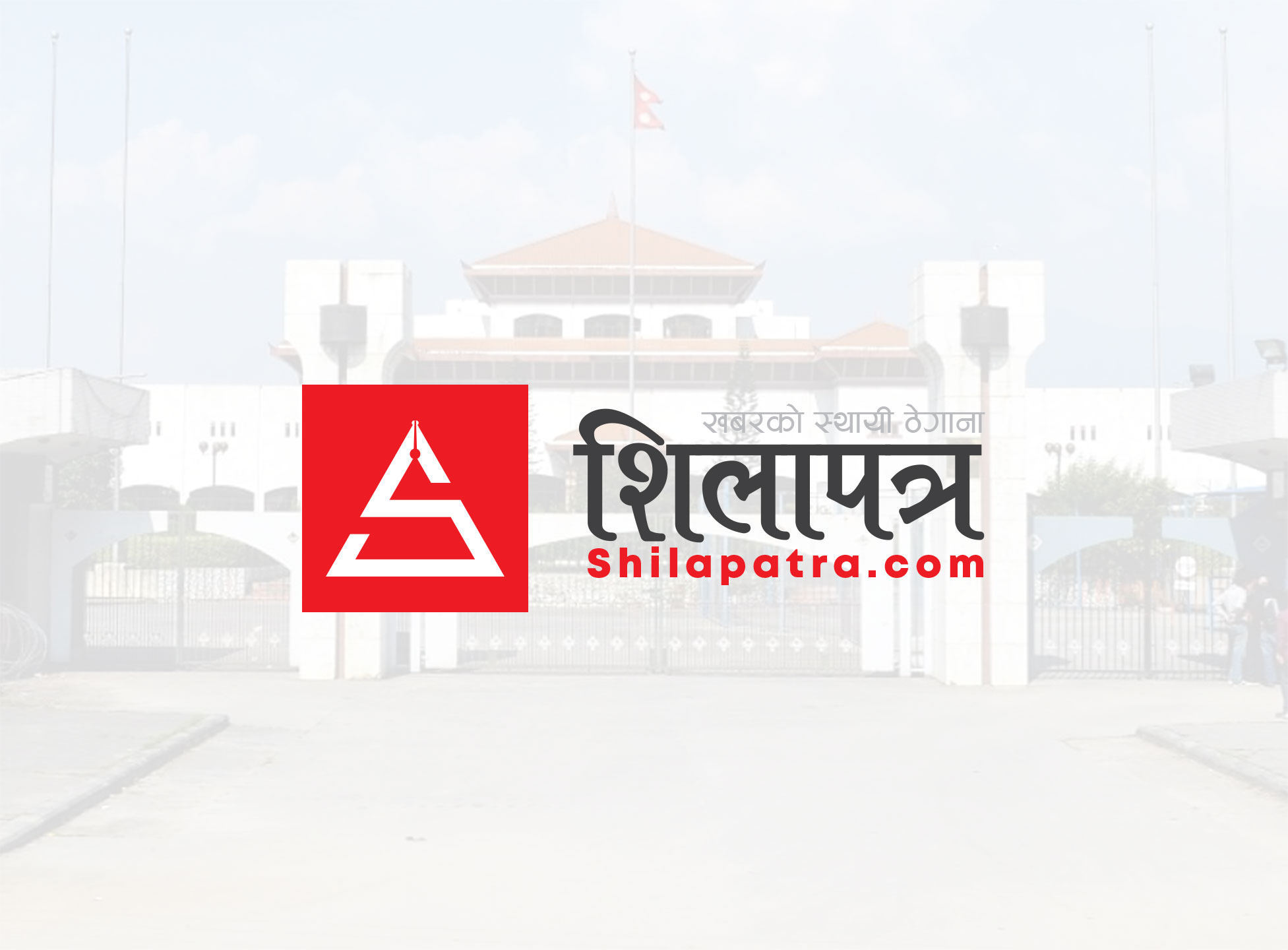
The color red for Shilapatra’s logo was chosen to evoke urgency, authority, and attention. These are the very qualities at the heart of journalism and breaking news. This powerful color also communicates energy and boldness, ensuring the brand stands out as a dynamic and trustworthy news media.
World Vision
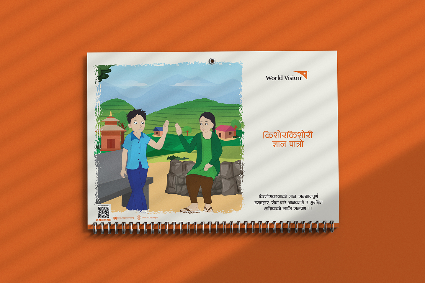
As the project focused on sexual and reproductive health and rights of Nepali adolescents, our designs aimed to make the content accessible, emotionally engaging for the young audience.
Playsmart
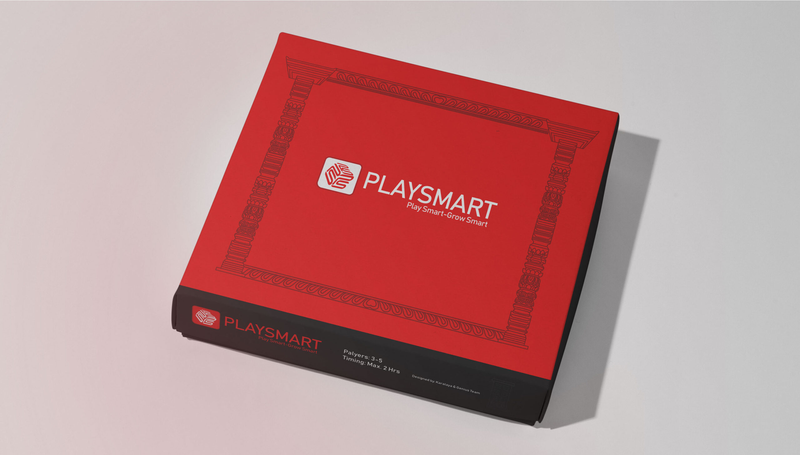
The logo features a stylized graphic, possibly incorporating geometric shapes or playful letterforms, alongside the “PlaySmart” name. Iterations likely focused on creating a memorable and versatile mark that appeals to children and parents.
