Category: Uncategorized
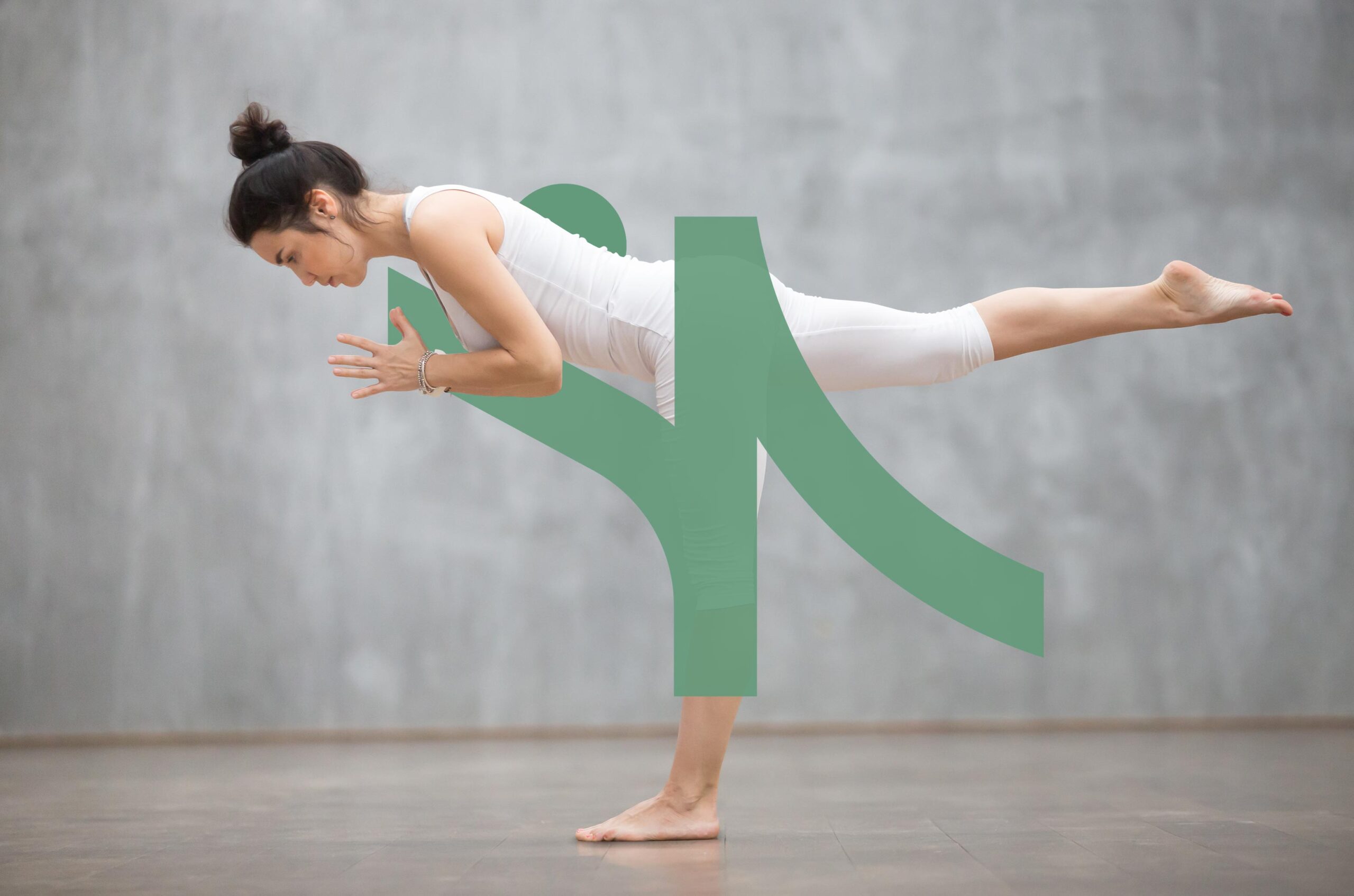
Nepal Yoga Academy
Attic Inn
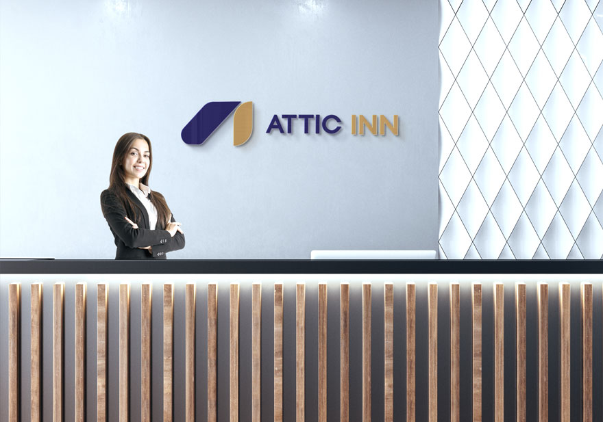
We carefully blended a stylized roofline with the letters “A” and “I” for the logo of the Attic Inn to symbolize home and comfort. Our designs went through several iterations to create a mark that’s both distinctive and timeless.
Metro-Mask
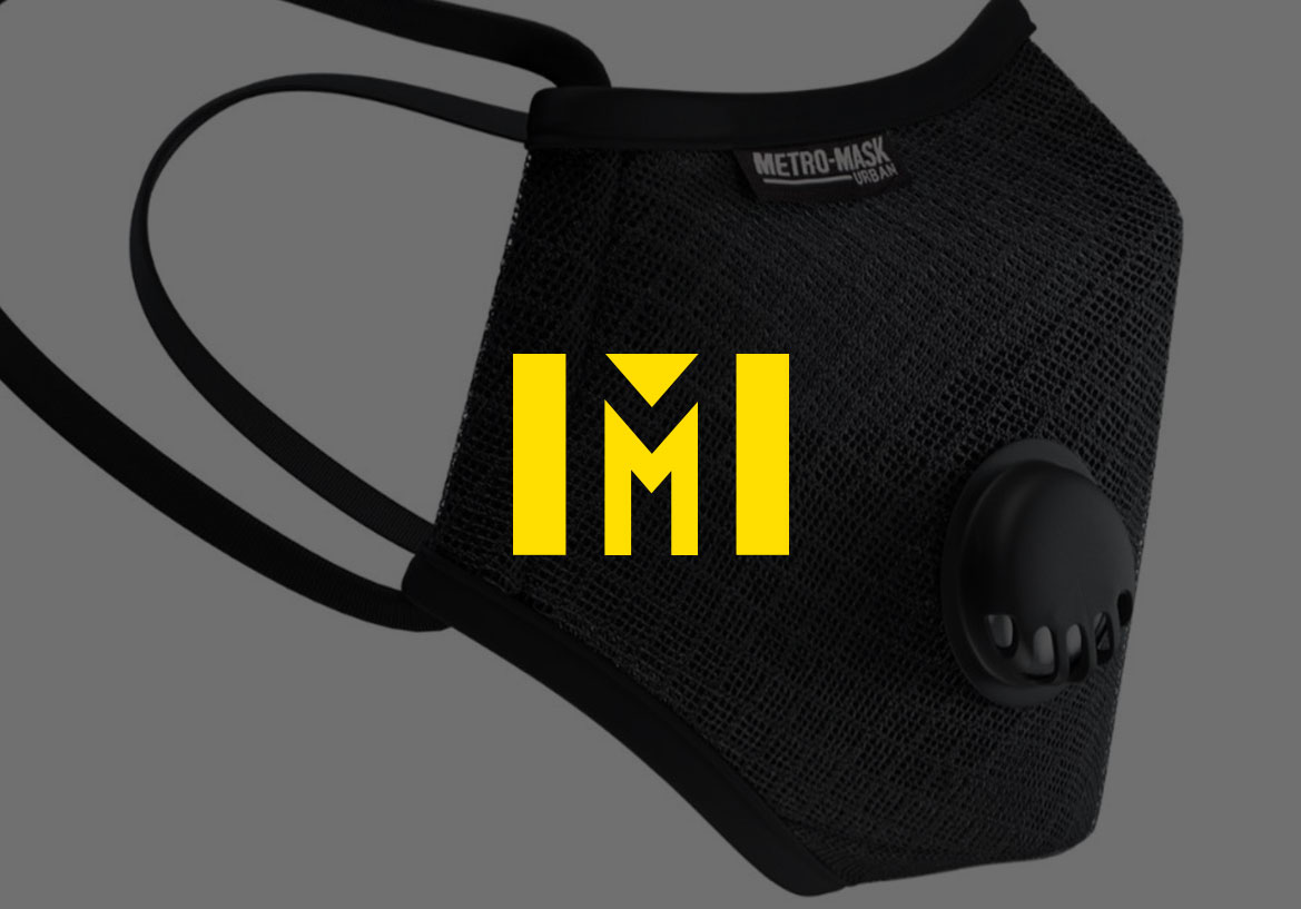
For Metro Mask, we created a bold and unforgettable logo. We used the striking interplay of solid black forms against a vibrant yellow background to craft the letter “M.” During the design process, we explored multiple versions of the dual “M” design, refining its clarity and balance to make sure it stands out across all applications.
Sonam Gear

Each social media posts for Sonam featured world-renowned Sherpa mountaineers and athletes. These posts employed minimalist layouts, and strong Himalayan symbolism, crafted to inspire, and engage.
Asiatic Roads

The logo for Asiatic Roads features a striking red and white color scheme with a clean, geometric “A” that subtly suggests pathways and connection. To ensure a memorable and versatile mark suitable for various applications, different stylizations of the “A” was explored.
Cwin

Since the organization aimed to promote child rights through illustrations, the designs needed to embody playfulness, inclusivity, warmth, and trust. This called for a cheerful, approachable, and nurturing tone and feel.
Vanity Men

The Vanity Men logo features a bold monogram, merging the letters “V” and “M” within a sleek circular frame to create a sophisticated look. This signature mark is also woven across brand materials to strengthen recognition and reflect a commitment to cohesive, high-end design.
